Contour
During my internship, I worked on the design of a museum exhibition. This experience made me realize there isn’t a streamlined way to create and collaborate on visualizations during the design process of museum exhibitions. Contour, my graduation project, aimed to solve this by introducing a flexible, easy-to-use online tool specifically for this use case.
Role
UX designer
Timeline
Feb 2020 - Jul 2020
Areas
Product Design
Research
Prototyping
Background
When I was an intern at Fabrique, I worked on designing a museum exhibition for the Design Museum of London. While it was a great project it made me realise there isn’t an easy way to create and share museum exhibition designs. There are multiple methods of creating visualisations, but they all come with significant trade offs.
Method
Immersion
Presentable
Easy to create
& maintain
Collaboration possibilities
Maquettes
Good
Poor
Poor
Decent
Floorplans
Poor
Poor
Decent
Poor
Sketches
Poor
Poor
Good
Poor
3D renders
Excellent
Decent
Poor
Good
Methods commonly used for visualizing museum exhibition designs
Understanding the problem
Together with Marlon Sijnesael I chose this as my graduation project. We started off with getting a better understanding of who our users are and what problems they face. We needed to move beyond anecdotal evidence from our own experiences, so we conducted interviews with 17 people involved in the exhibition design process at 6 major Dutch museums. This gave us insight into what the design process looks like across different types of museums and the challenges faced in that process.


During our research we got great insights into the exhibition design process
We mapped out all the different people involved in the design process of a typical exhibition and what their needs and pains are. It became clear that there is a core group of people doing the actual design work and a larger group of people who need to be kept in the loop at different moments and being able to give their input.

Actionable insights
Our research revealed a lot of specific problems and challenges, from all this we distilled four actionable insights:
Visitor perspective: Designers need to see the exhibition from the visitor’s point of view. Abstract visualizations make it hard to grasp the actual experience.
Low barrier: Most users lack experience with 3D software and use tools that don’t suit their needs.
Easy sharing and editing: Physical visualizations are hard to share and 3D scenes require complex, specialized software.
Centralized feedback: Feedback is often scattered across different tools (like Excel), making it hard to track and act on.
Approach
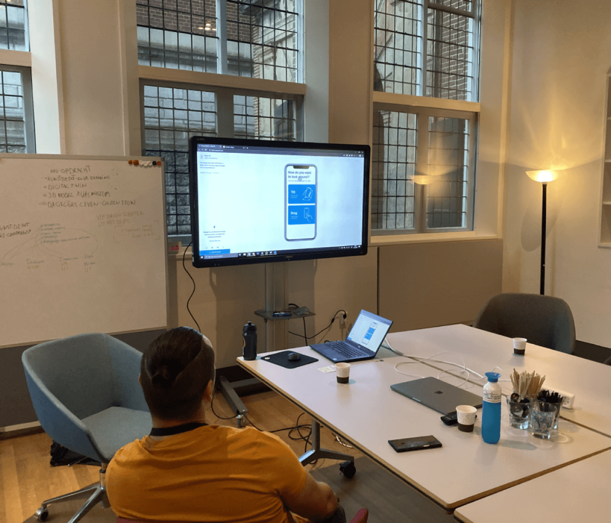
To ensure we build something desirable for users, we heavily utilised a co-creation process. We worked closely with the Rijksmuseum throughout the project, regularly sharing prototypes with their staff to gather feedback. By working directly with users we were able to quickly learn and adapt while keeping a fast pace of design and development.
Conceptualisation
We explored and tested different concepts for how to make the creation of 3D environments as accessible as possible. We both low-fidelity and high-fidelity prototypes.

A collection of early-stage prototyping and testing
Because our users are often unfamiliar with 3D applications, we aimed to simplify as much as possible. One area that we put significant effort into was the behaviour of moving around objects. A great example of this is how objects automatically snap onto walls and show you the height they are placed at. We spent time tweaking behaviour to strike a balance between freedom and ease of use.
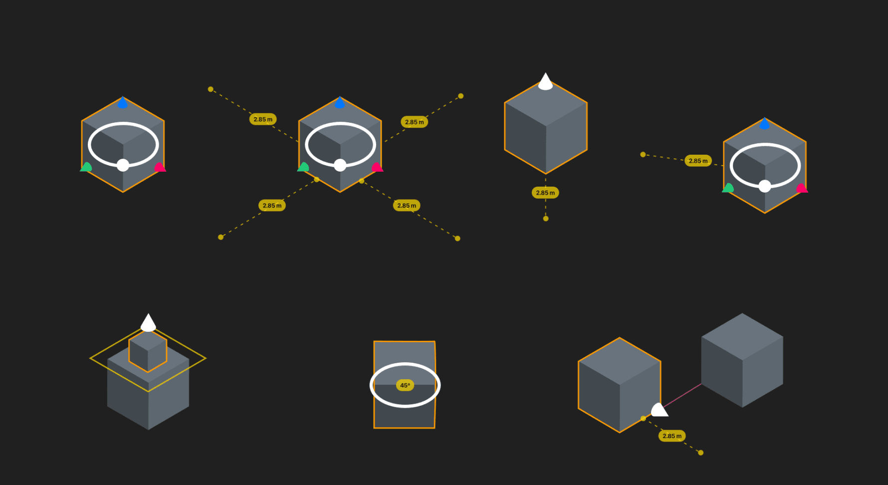
We invested considerable effort in making 3D behavior as accessible as possible
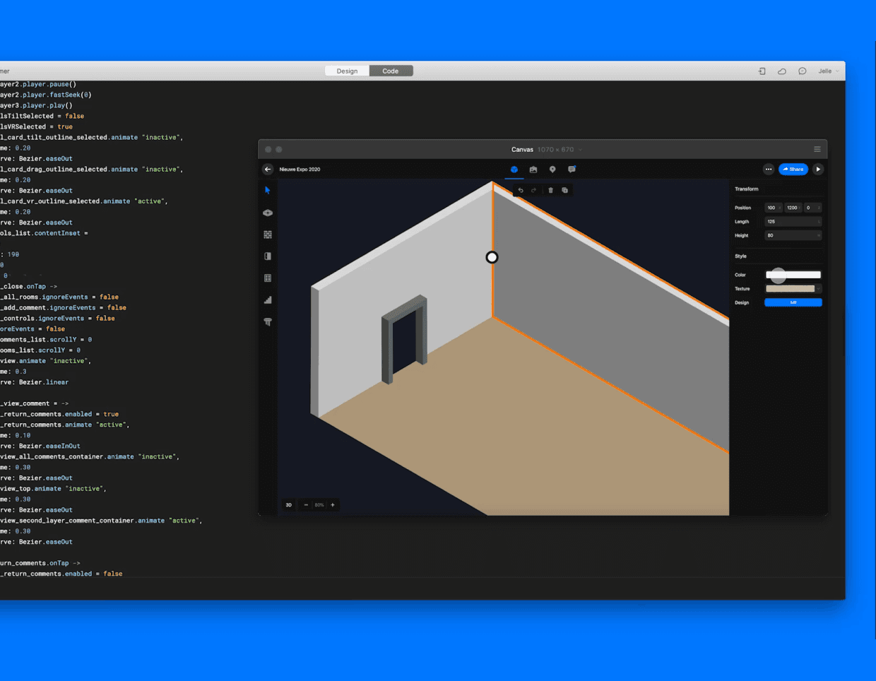
Testing showed that users could quickly become overwhelmed by too many options and controls. We discovered that a larger canvas gave users a greater sense of control, especially for positioning themselves in the 3D environment. To address this, we made the interface as minimal as possible, maximizing the canvas size.
Subsequent iterations increased the viewport area for more control
Final design
Recreating a space
Users create their exhibition designs in the editor. The easy to use room building tools allow for the quick digital recreation of a space. The material and color of the building can be set by the users.
Placing objects
The asset panel shows all the objects users can place into the room. You can pick from ready made assets or upload your own assets like paintings. Placing is made easy with smart snapping onto walls.
Sharing
Designs can be easily shared via a link. Depending on access rights, users can view or edit the design. The comment tool allows users to place feedback directly in the design, so feedback is always in context.

Look and feel
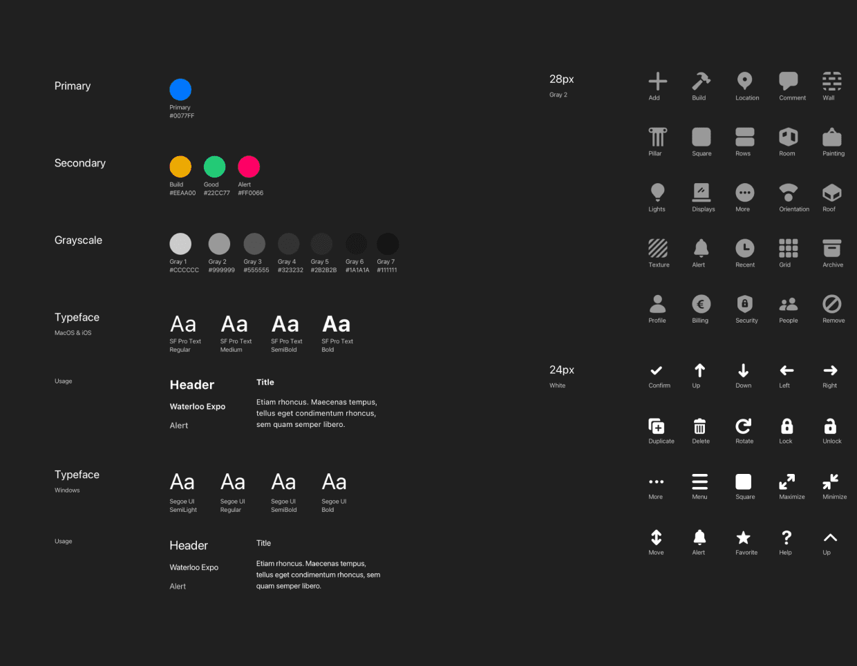
To create a coherent design and implementation we set up a design system. We chose a style that feels sleek but with friendly icons.

Outcome
By the end of the project the Rijksmuseum tested Contour in the design process of an upcoming exhibition. It was received very favourably by users with the ease of use and collaborative features being especially praised.
We received the highest possible grade for this project and even won the HKU Innovation award of 2020! Contour was selected from a list of the 20 best HKU projects. Unfortunately, we were not able to pursue a commercial future for Contour due to the effects of the 2020 pandemic. Despite this we are very proud of what we have been able to create in just under a year.
Receiving an HKU award was a great honor for us
Learnings
The power of co-creation.
We were working on something that changes the way people work. Co-creation allows for continuous insights and get your (future) users and stakeholders onboard.
Look beyond direct inspiration.
We looked at more then just tools. The Sims series served as a big inspiration for how to make 3D manipulations accessible to a wide group of people.