Sunweb
Sunweb, a major European holiday package provider, had been experiencing a decline in customer experience over the years.
To address this, we implemented 'Simplified Sunweb', an overhaul of their digital touchpoints. The goal of this project was to enhance the booking experience and improve conversion rate.
Role
UX designer
Timeline
Jan 2023 - Feb 2024
Areas
Product Design
Design Systems
Research
Prototyping

Background
Sunweb has been around since the 90s. They were one of the first to make the jump to the web. By 2022, their digital touchpoints were beginning to feel outdated and not reaching their conversion targets. I was part of a team from Fabrique that was brought in to revamp their entire digital footprint.
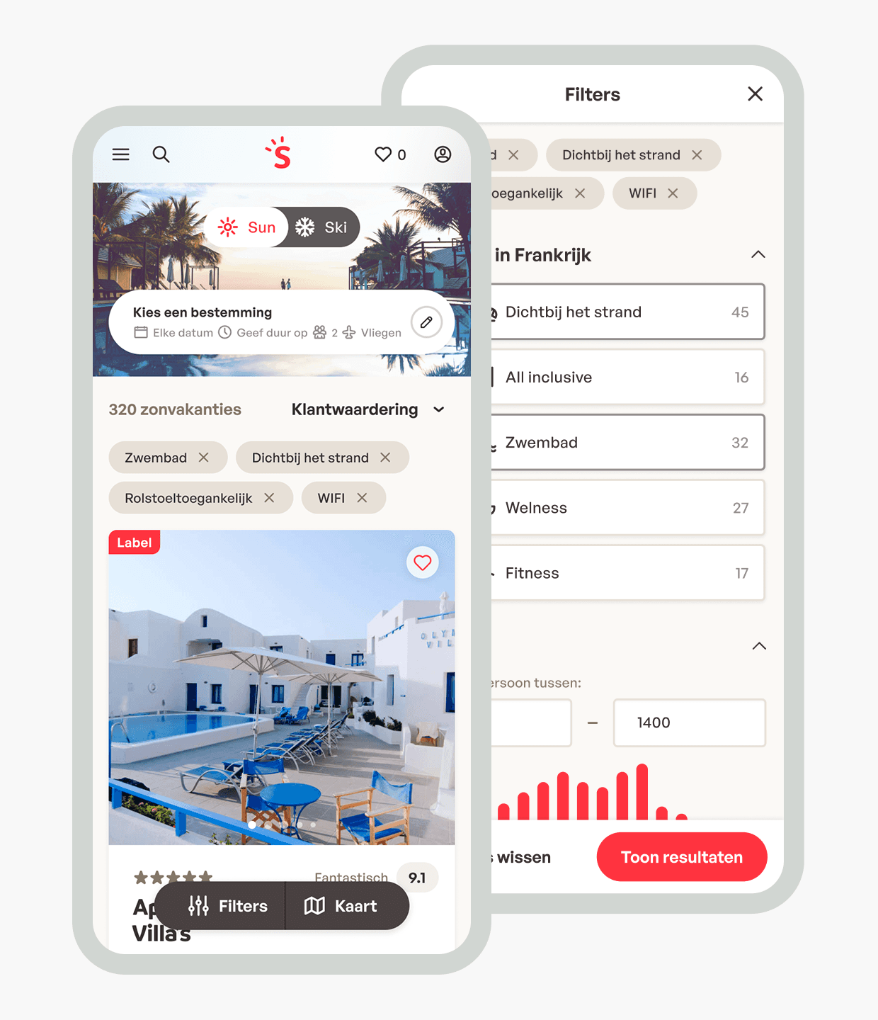
Although Sunweb claims to be customer-centric, their online platforms did not always reflect this. Existing research revealed several fundamental issues with the user journeys:
Heavy focus on text instead of visuals
Too many options to choose from, no tools to help users choose
Overwhelming amount of information and irrelevant details
Hard to get a complete picture of what I am buying
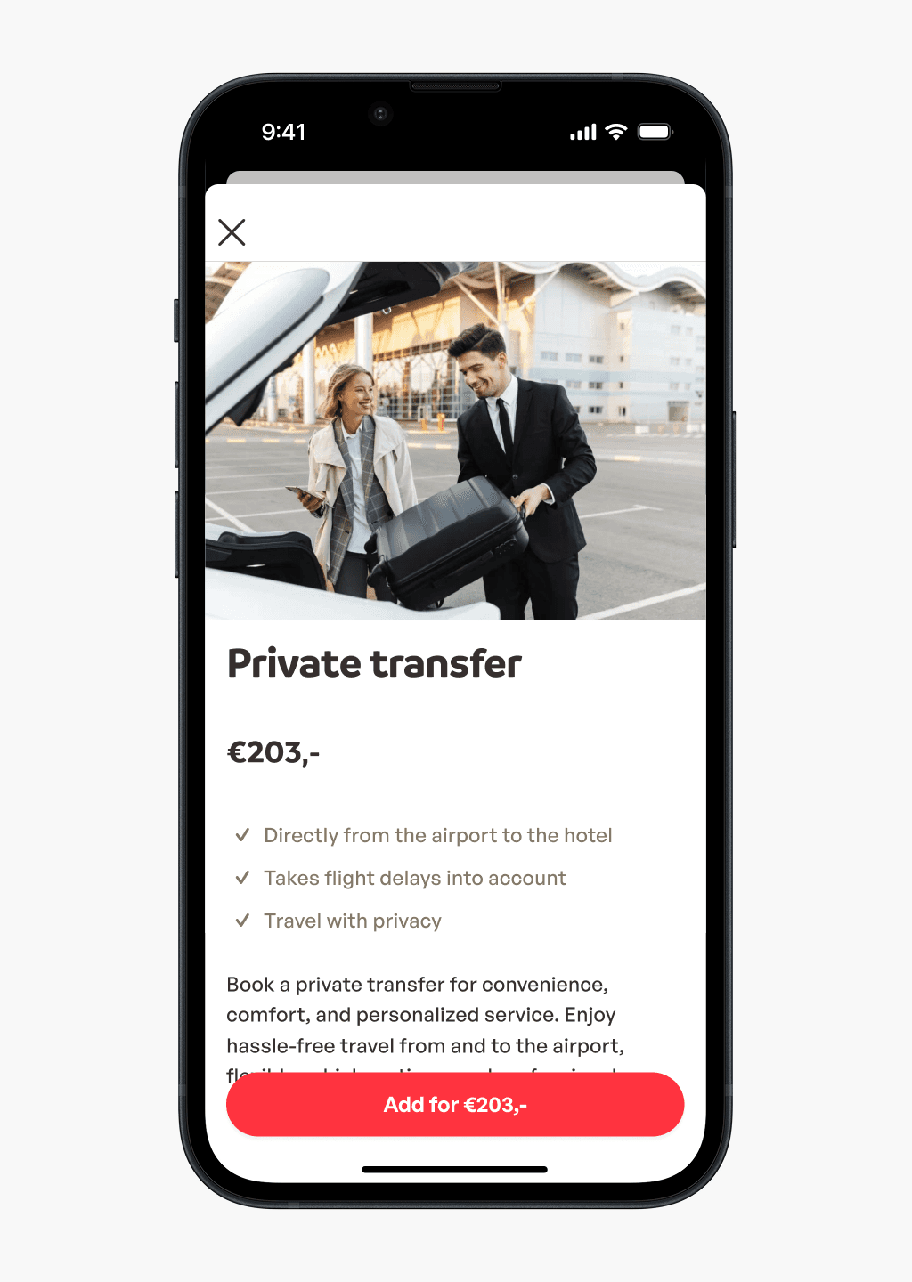
Add-ons feel forced, brought up at irrelevant moments
Brand feels plain and static
Approach
Given the wide range and scope of issues, we kicked off the project with a design sprint together with the client to develop a future vision for Sunweb’s digital touchpoints. The focus was to determine what users truly desire through ideation and research.
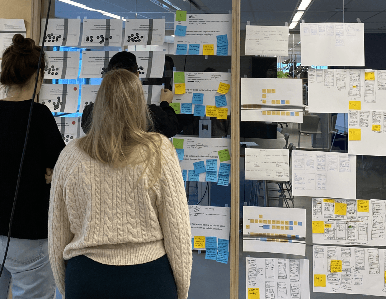
We explored a wide range of scenario's

We turned our sketches into wireframes
After several rounds of iteration, we created a final prototype of the 'concept car' containing all the desirable concepts. This prototype was tested with both new and existing Sunweb customers. Our tests validated most ideas and highlighted which ones to discard or refine.
A walkthrough of the concept car created during the design sprint.
Making it real
We split the concept car into separate initiatives for Sunweb’s product teams to work on. These initiatives were prioritized based on expected impact on conversion, brand perception, and effort. Our involvement ranged from direct design work to supporting internal designers.
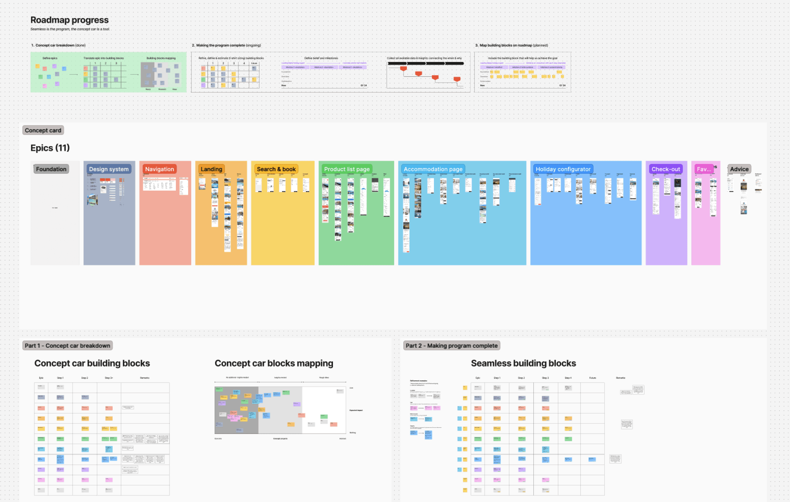
We broke down the concept car into separate building blocks
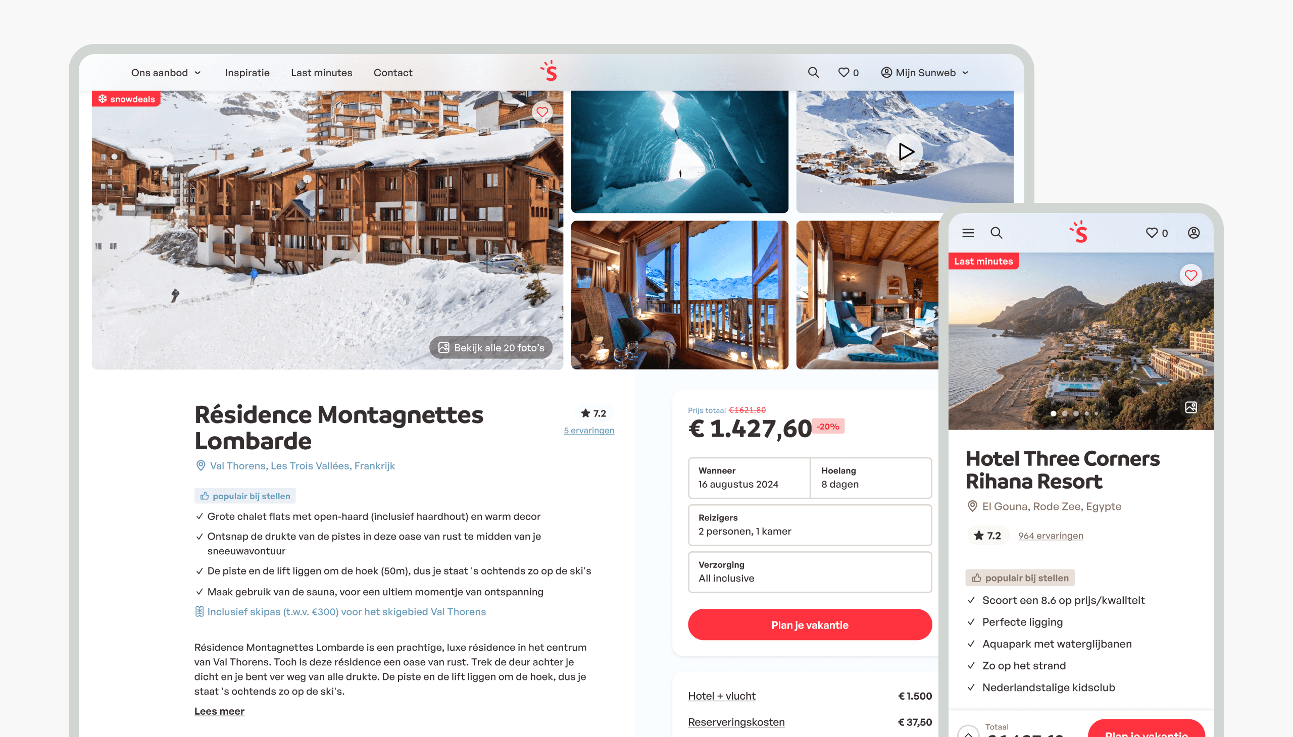
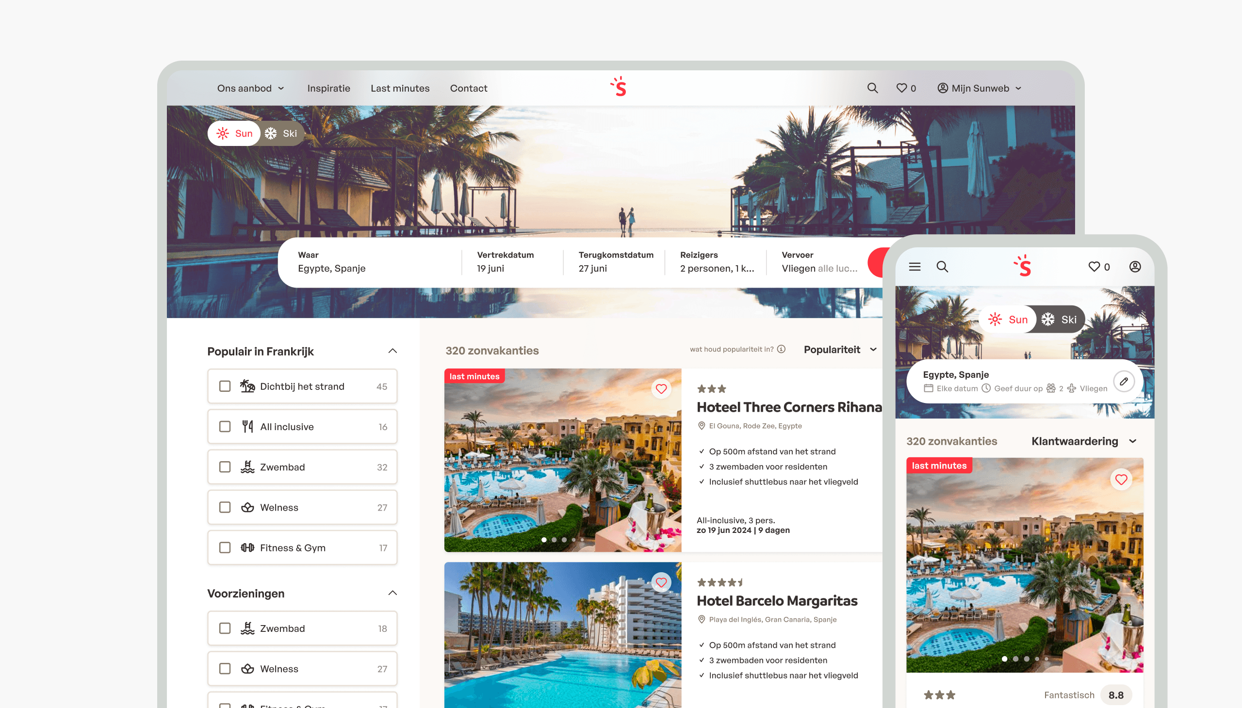
Throughout the year, we implemented multiple features and flows from the ‘Simplified Sunweb’ program into the website. Sometimes this meant redesigning entire pages, like the product detail page; other times, it involved implementing individual features, such as the new and improved search.
Testing was central to our approach, using both qualitative user tests and quantitative A/B testing to ensure we got it right.

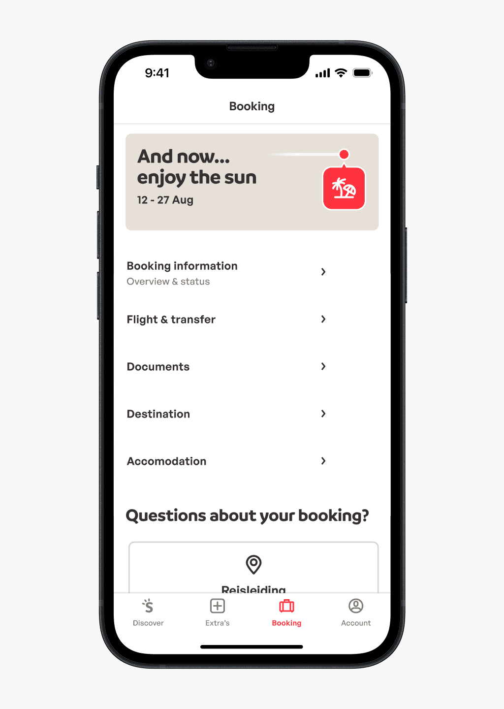
The app
We also redesigned the Sunweb app, aiming to make it the 'remote control' of your holiday by offering guidance and inspiration before and during your trip. Everything in the app is designed to:
•
Offer a better guidance and support
•
Increase the booking rate of add-ons shortly before or during holiday
•
Increase retention rate
•
A stronger brand experience
App Store rating
4,6
Play Store rating
4,5
Total downloads
800K+
The new app focuses on your next or current holiday, empowering users to get the most out of their (holi)day by showing new and relevant information daily.
Other holidays and features are just one tap away. With this new structure, we’ve created a more distinctive, accessible, and easy-to-use app.


Design system
A good design system is a crucial enabler in any redesign. When we started this project the design system had several shortcomings:
•
No single source of truth: design was not aligned with development, some components didn’t exist in code, naming conventions differed, etc.
•
Lack of documentation and best practices.
•
Not set up to handle the different sub-brands that use the same components in different styles.
•
No guidance for new designers or developers.
With simplified Sunweb we also wanted to do a evolution of the brand, simplify and clean up certain brand elements. In order roll these changes out we set out to bring the design system up to a higher level. We based our approach on earlier experience, interviews with users and general best practices.
We cleaned up colors, typography and spacing and implemented a naming convention that is the same between code and design. The improved design system allows one to easily see which components and styles are available for which brands and platforms, removing uncertainty.

Components received a 'simplified Sunweb' makeover. Every component has documentation about usage, best practices, accessibility and examples.

We make it clear where to get started and what our guiding design principles are so everyone is on the same page.

Impact
My involvement in this project spanned a period of 13 months. During this time we managed to implement quite a number of our initiatives. While we couldn’t implement all the improvements we wanted due to development capacity challenges, I am proud of what we achieved.
Conversion increase
+13.3%
Retention increase
+16.7%
Learnings
A key learning for me was being able to work both bottom up and top down. Improving the design system for example requires one to be able to work on very specific parts, but also being able to take a step back and see the bigger picture.
I also gained a lot of experience in mixing both quantitative and qualitative user testing on short notice.