T-Hive
The autonomous systems team at Toyota faced a challenge designing warehouse layouts due to a lack of user-friendly tools. T-Hive Digital Twin was created to address this need and bridge the gap between sales and commissioning.
I led the design effort for this tool, introducing a streamlined design process and addressing core user needs while laying the foundation for ongoing development.
Role
Design Lead
Product Designer
Timeline
Feb 2022 - Dec 2022
Areas
Product Design
Design Systems
Research
Prototyping
Stakeholder management
Background
T-Hive is Toyota Industries’ center of expertise for Autonomous Guided Vehicle (AGV) software. These vehicles are used in warehouse logistics operations to move cargo for companies such as Amazon, DHL and Zalando.
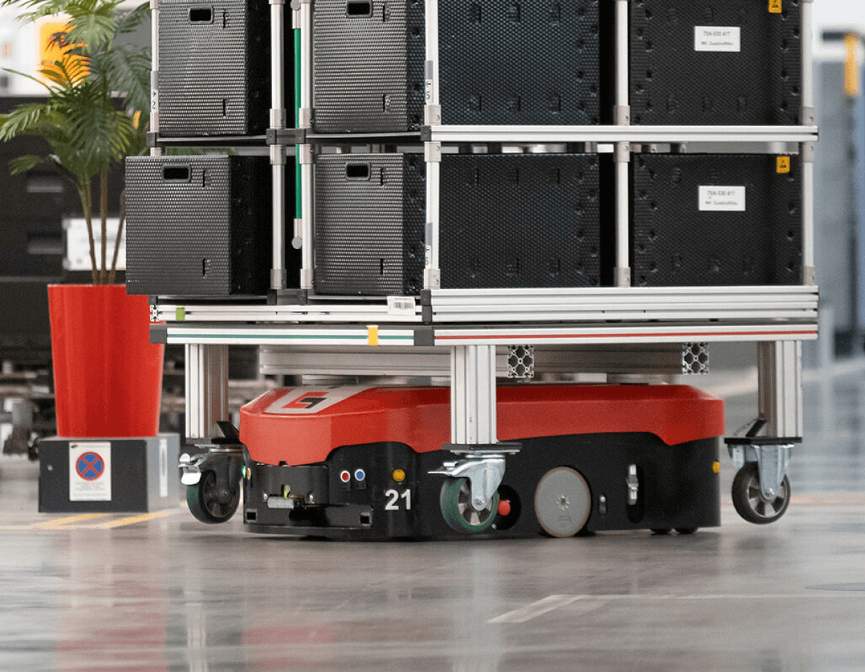

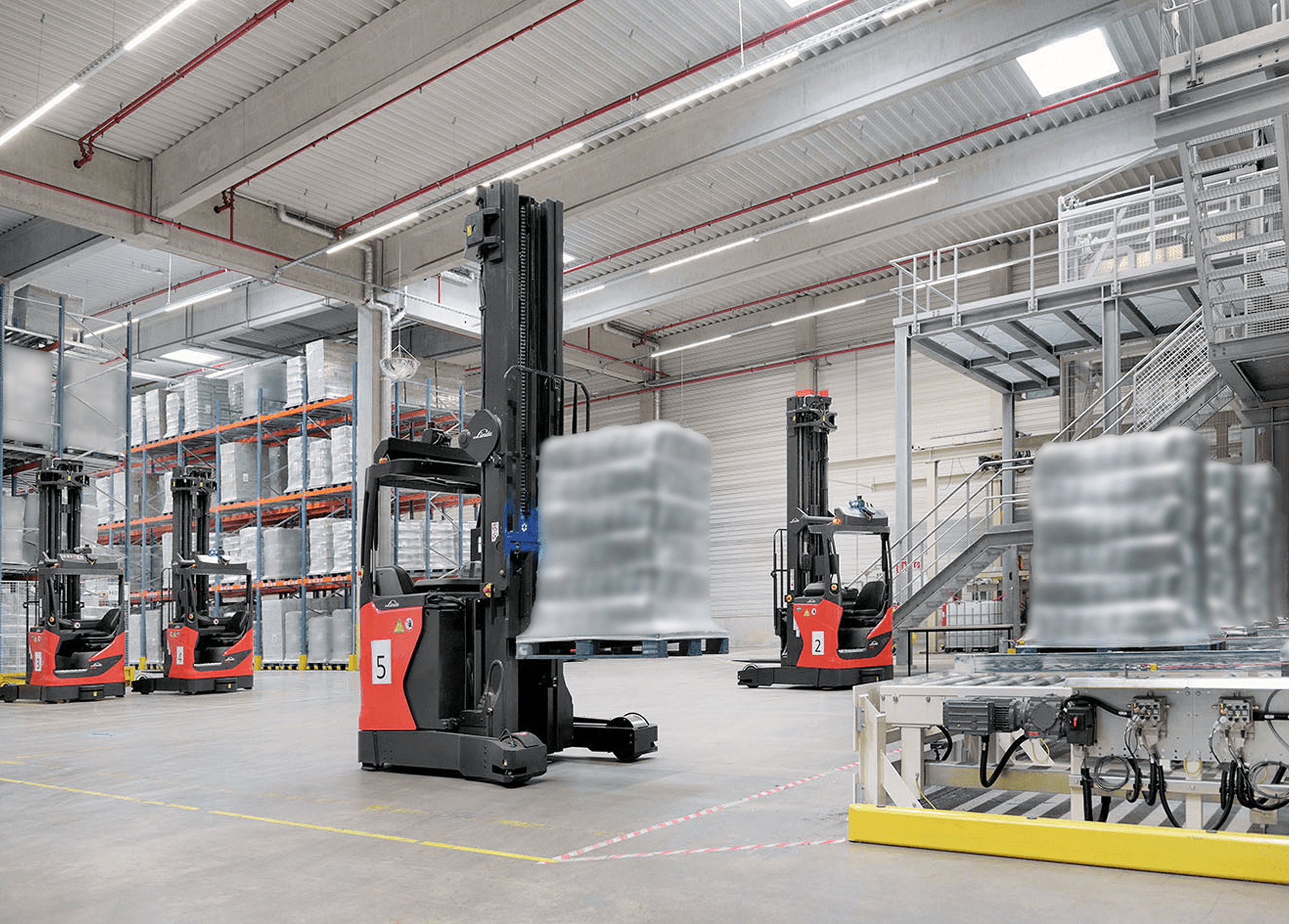
Examples of AGV systems and warehouses
A key challenge for T-Hive was that designing warehouse layouts required specialized programming knowledge, limiting the task to a small group of experts. We were tasked with transforming this programming language into a browser-based tool that can be used by their engineers and sales people.
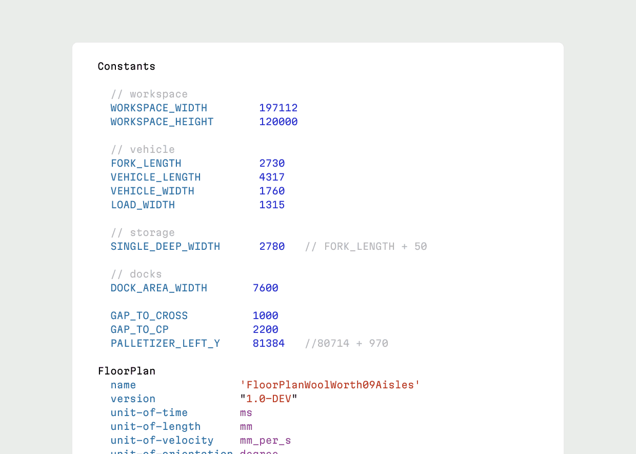
Layouts can only be created with coding knowlegde
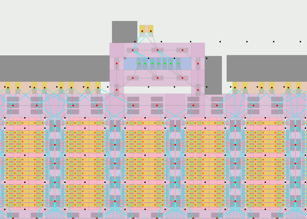
The output is not directly editable and looks cluttered
Approach
At the start we faced a challenge: the client wanted to begin development in just two weeks, leaving little time for research and concept development. We focused our limited time on researching the following:
•
Who should use this tool?
•
Does the idea of this tool make sense within the intended context and workflows?
•
Users their current workflows, tooling and pain points.
•
What will the (new) workflows look like?
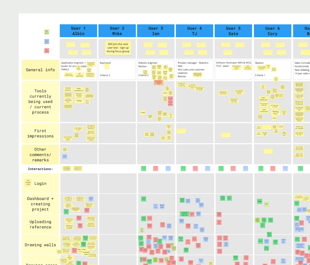
We conducted interviews with 24 different people at Toyota involved in the sales and commissioning of autonomous systems.
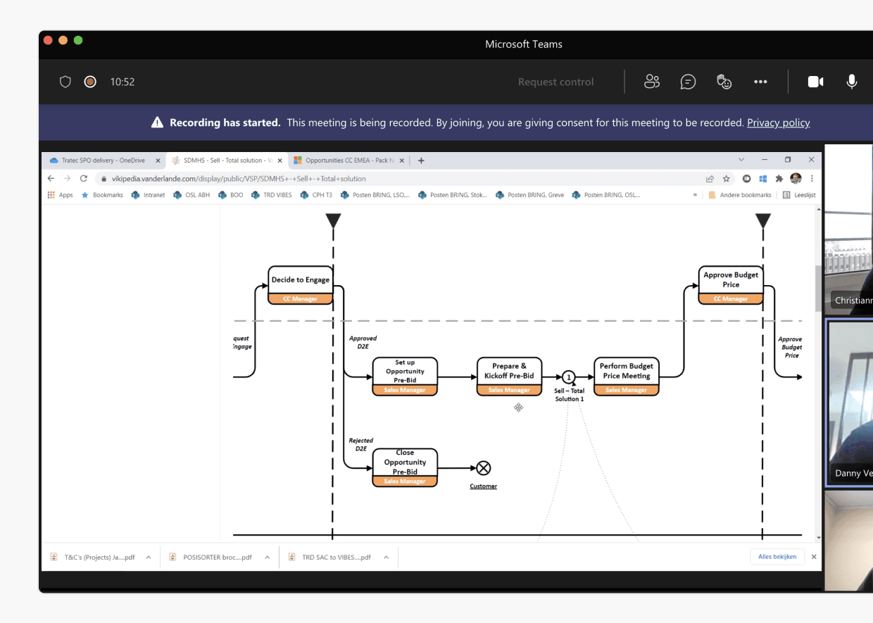
Interviewing the people involved with AGV systems
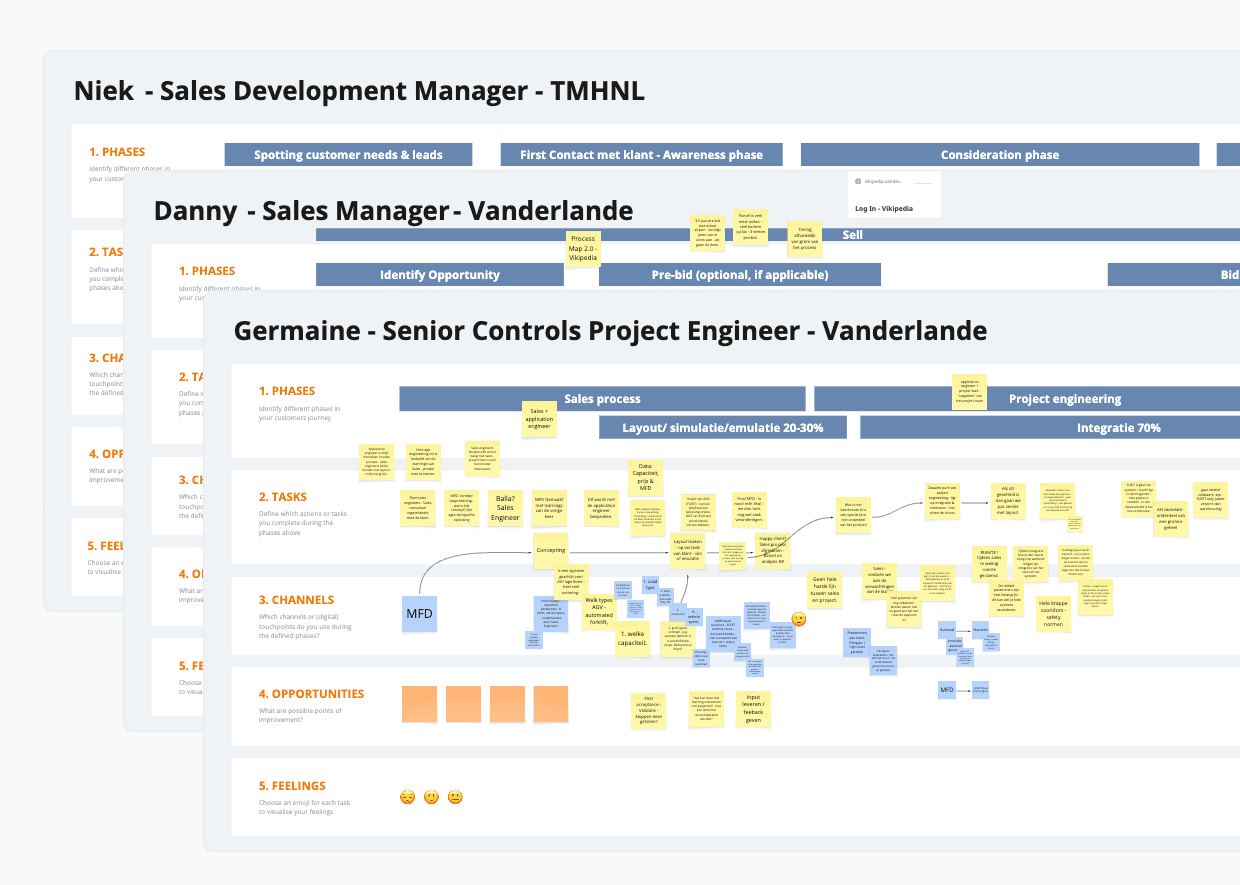
Mapping out user's their current processes and pain points
Key findings included:
The transfer from sales to commissioning is messy due to varying expertise levels
The code-based system is not intuitive for most users
Knowledge about AGVs and layouts varies significantly between individuals
Layouts are not professional enough for client demos, requiring time consuming custom 3D renders
The local application makes collaboration on larger projects difficult
Making changes in code is complicated, with poor version and change tracking
Concept development
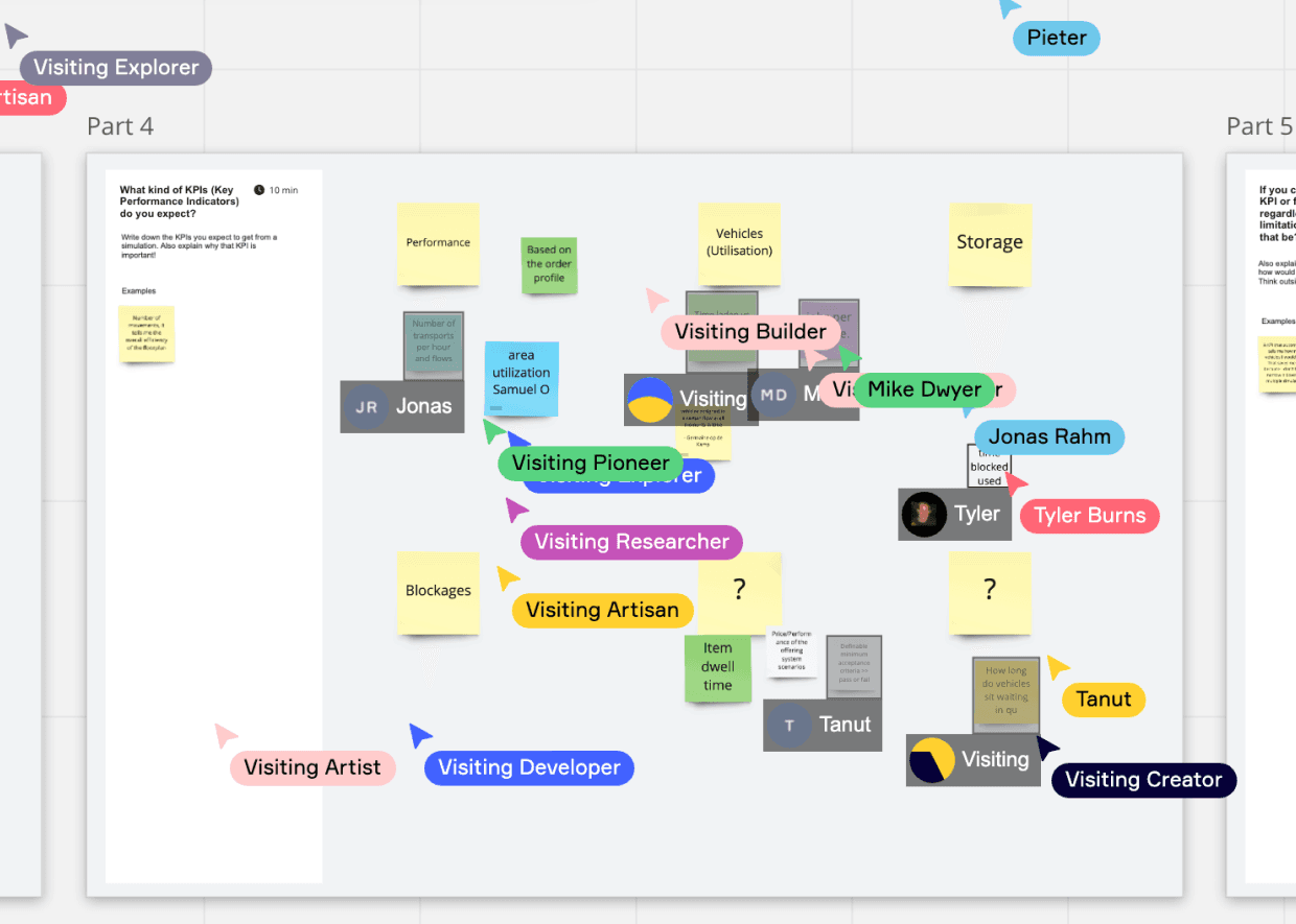
Another challenge was the client’s lack of a shared product vision. We used our remaining pre-development time to figure out the overall design of the Digital Twin and testing it with potential end users. We explored whether the tool should be fully canvas based or should contain an “expert mode” that allows coding more complicated things. We created and tested rough prototypes around what we knew to be common workflows.
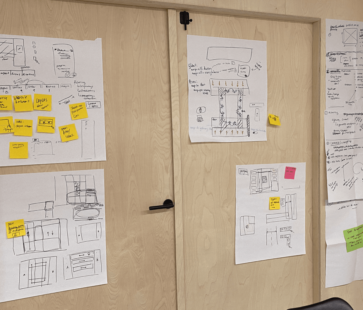
Creating Digital Twin workflows and features through prototyping and testing
Building it
It was important to deliver something quickly so we could learn and adapt. We knew we had to get the core features right. We started each feature with rapid prototyping and testing. Frequent user focus groups and testing sessions ensured we were building something that aligned with our user needs. This constant cycle allowed us to implement learnings quickly.
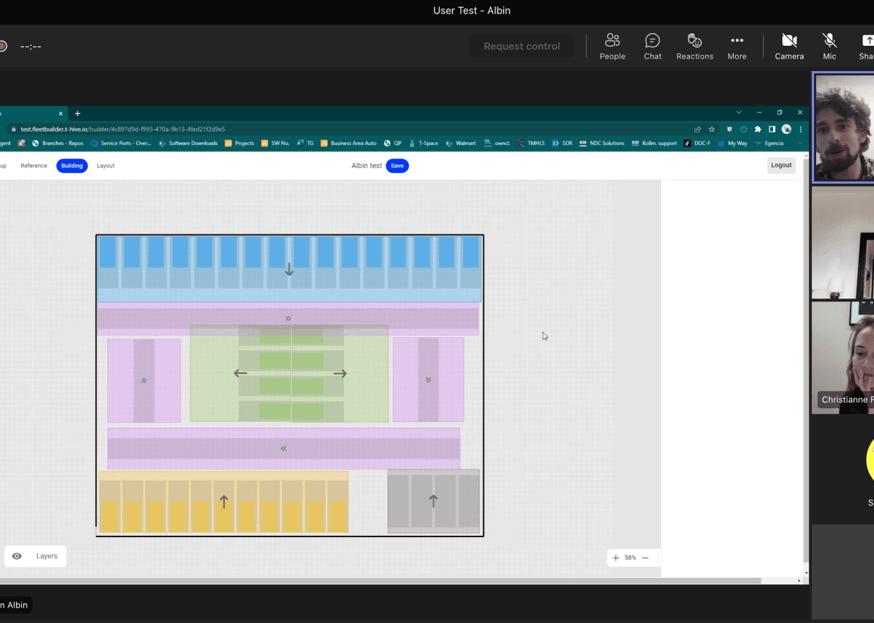
User tests where conducted frequently
Monthly stakeholder focus groups
Design
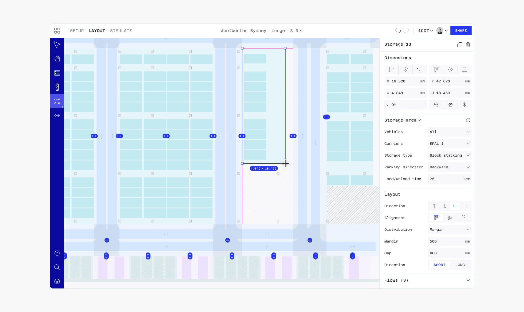
The end product is a tool that allows users to draw AGV layouts in their browser. Digital Twin is split into three tabs that group tools and features in a way that aligns with typical workflows. A context sensitive properties panel allows users to manipulate selected objects.
Creating layouts in Digital Twin
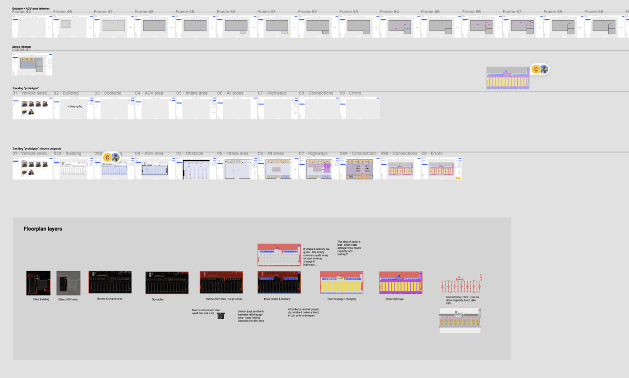
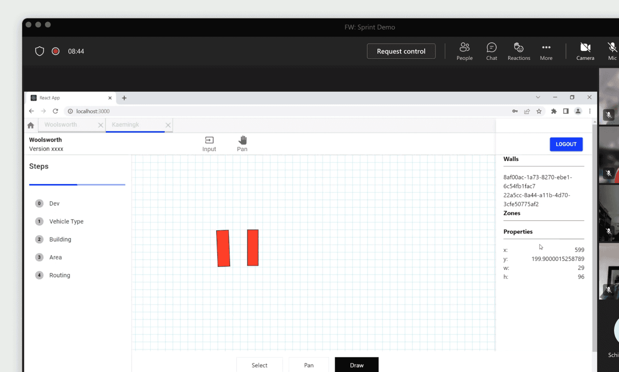
Drawing
Users can draw walls, obstacles (like pillars) and areas. Areas are the sections of the warehouse where the AGV's pick up loads, store them, drop them off or charge themselves. Each area contains ‘positions’—spaces marked for AGVs, indicating possible orientations.
A drawing prototype
Considerable time was spent on drawing behaviour. Incorporating all required logic while keeping it easy to use was challenging. We created many prototypes to refine the behaviour.
We used prototypes to tune in drawing behaviour

Detailed documentation was created for smooth delivery
Routing
The most complex part to design was routing, which defines how AGVs travel between areas. We developed an intuitive system for users to specify AGV routes. Digital Twin shows connections between areas and roads per direction as editable nodes. For more finer control, users can change how all the individual positions are connected. It took us a few test iterations to make it intuitive.
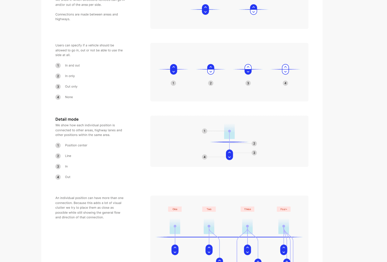
Extensive documentation detailed the behaviour
ProtoPie was used to create realistic prototypes
Simulation
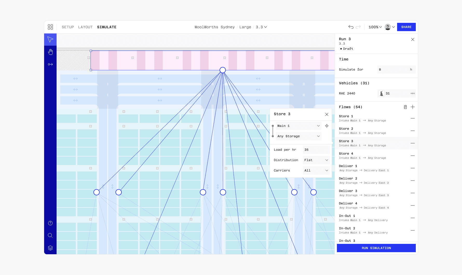
Because simulations can take a long time to render we made it, so that they can run in the background without interrupting work in the editor. To set up a simulation, users specify the duration and AGV workflows. We came up with a system that is easy to use for beginners while also speeding up power users.
Setting up a simulation
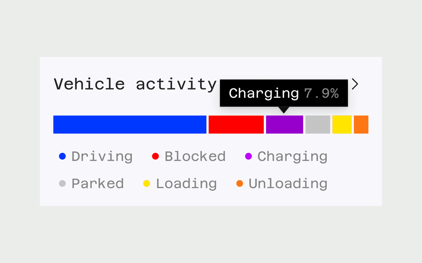
Completed simulations can be viewed in 3D. This not only allows users to see exactly what is happening, but also makes for impressive customer demos. Users can see the KPIs at a glance and are able to drill down for specific statistics. A heatmap overlay highlights trouble spots where traffic jams occur.
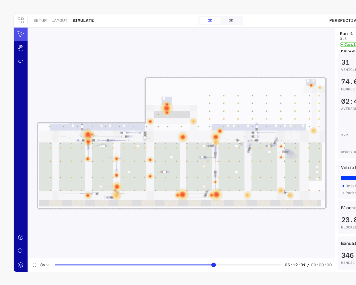
Use heatmaps to identify trouble spots
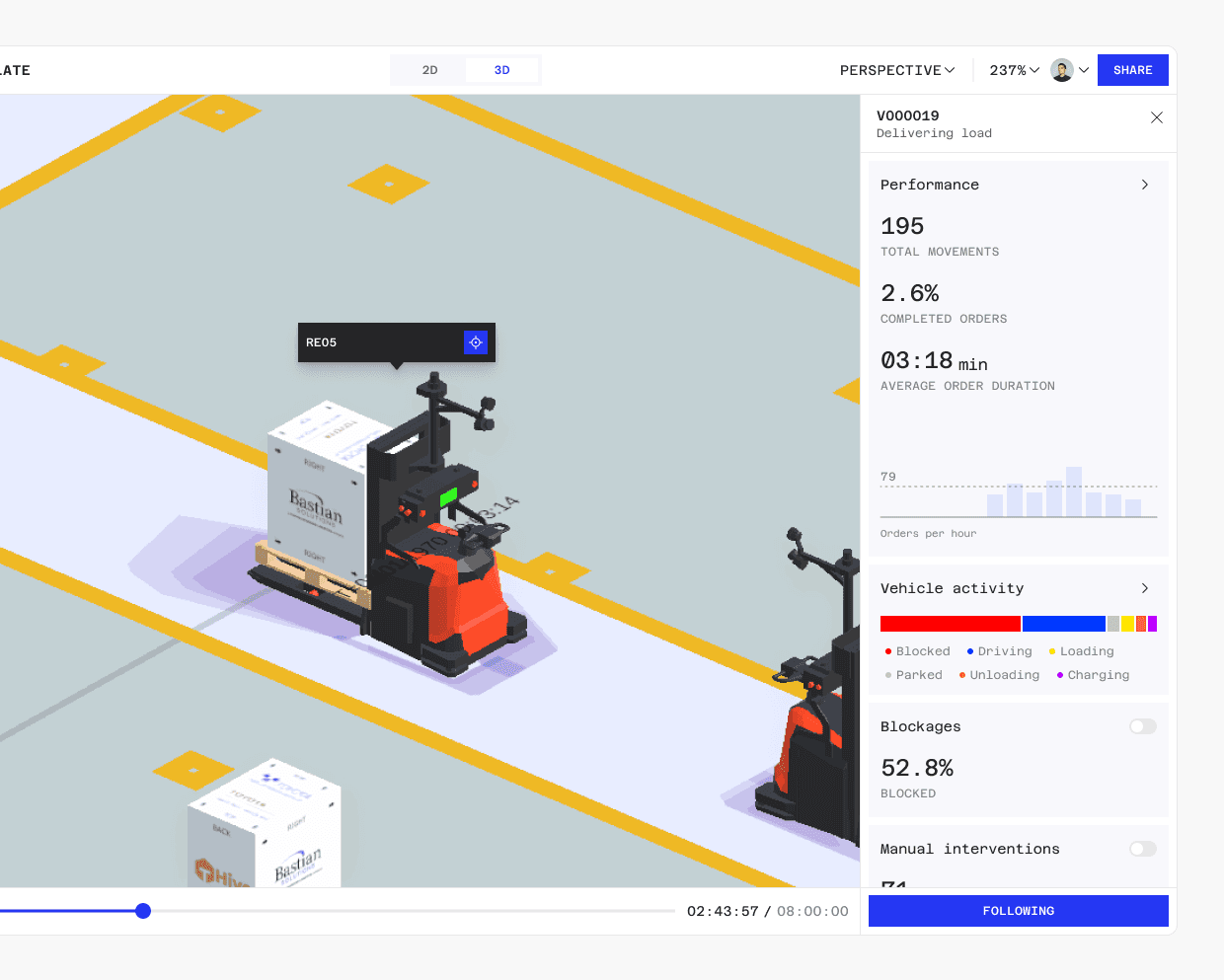
Drill down to see detailed information
Look and feel
Our goal for the Digital Twins look and feel was for it to be utilitarian with a bit of character. It should celebrate its technical side without feeling overly complicated and highlighting the system's impressiveness. To speed up the design and development we created a library of reusable components ensuring consistency throughout the application.

We set up a flexibel component library with documentation and guidelines
Outcome
By the end of our involvement, we had shipped all core features and were already planning the next iterations, which will be handled by Toyota’s internal team. I am very proud of what we achieved, especially given the limited time at the start. Our approach of involving users and stakeholders in a co-creation process helped steer the product in the right direction from the get go.
This project highlights the importance of early and continuous feedback from users and stakeholders. It also showed me the value of listening to your most vocal power users—even if they are a small minority, they are often the ones who use the product most intensively.